
This summer, we’re rolling out a refreshed logo and new brand slogan.
Changing up the visual look of your business is exciting and, not gonna lie, a little scary. After 29 years in business, Charleston Cotton Exchange is established in the community. Businesses of all shapes and sizes rely on us for branded apparel and promotional products.
We worried changing up our visual brand would be confusing. We certainly didn’t want customers to assume we’d sold the business or there was a problem.
At first the idea of a logo change felt unnerving, but the more we discussed it with local graphic designer Andrew Barton (https://andrewbartondesign.com/), we realized it was a necessary change.
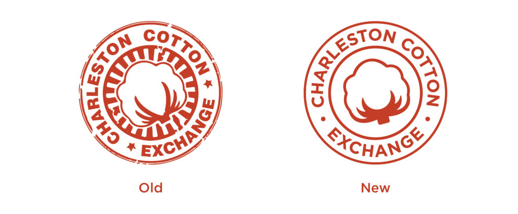
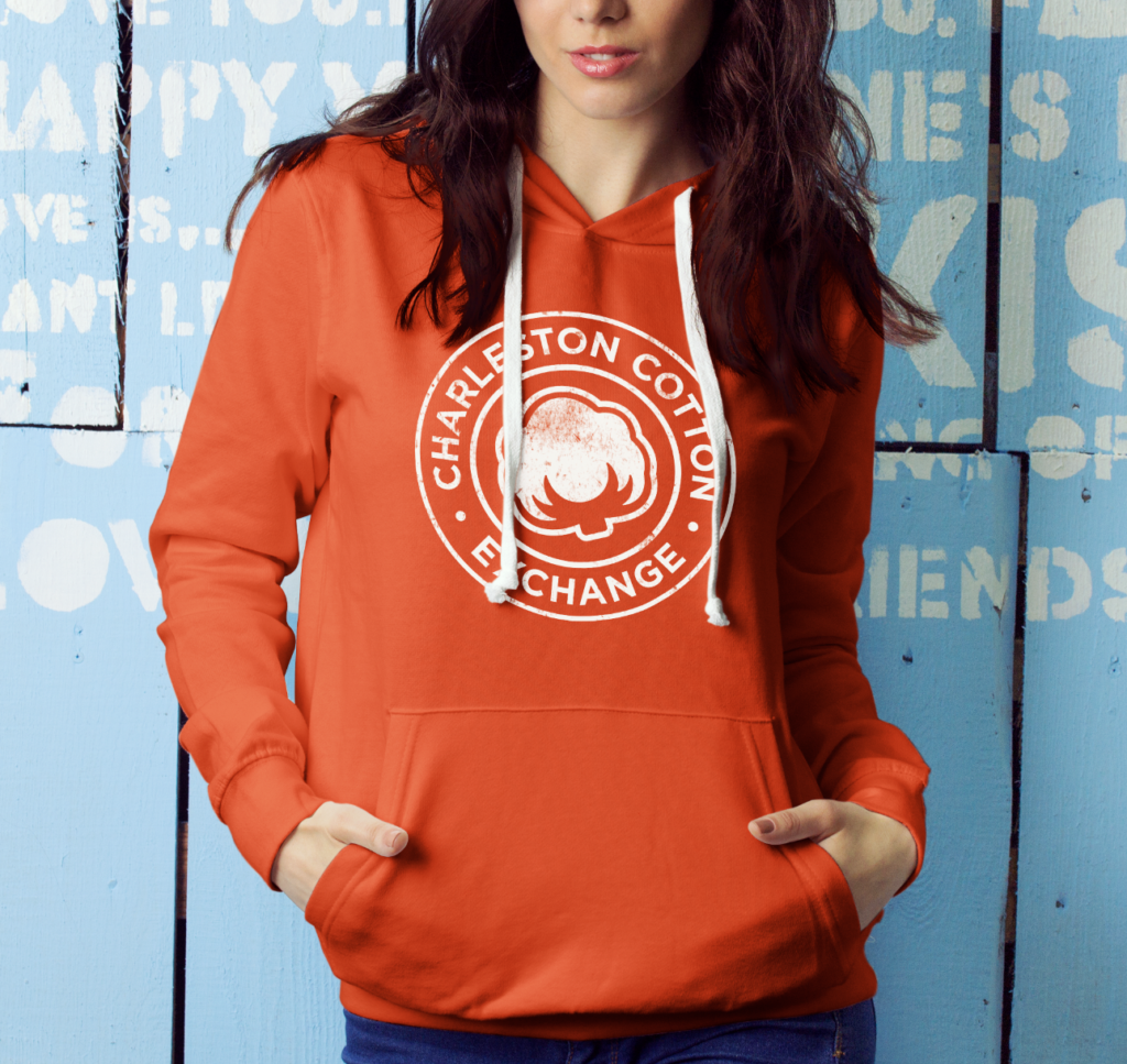
First, we needed more consistency in our visual brand. We needed logo options that worked horizontally and vertically. Sometimes the cotton ball graphic was white and sometimes it was another color. We needed a logo that would look great on both T-shirts and banners – without having to deviate from our core visual brand standards.
Second, our logo was dated. It had been more than 25 years since we’d created our cotton ball logo, and it showed. But, we still love the cotton ball icon, and it’s become a recognizable part of our business. That’s why we opted for a brand refresh versus a complete rebrand. We could keep the iconic aspects of the brand while updating the pieces that felt old and outdated.
We removed the distressed (and dated!) texture around the cotton ball. Then, we decided the cotton ball would be white in every logo instance – again, to maintain consistency. We also upgraded the fonts to ones that are more clean and modern.
Lastly, we added a slogan: Be Brand Brilliant. Because that’s exactly what we want for our customers!
Third, the timing was right for a brand refresh. We were about to invest in new signage for our West Ashley office. Anytime you’re creating a visually big project like signage, billboards, or a large apparel order, it’s a great time to give your logo a second look.
A good rule of thumb is to review your logo every 10 years. It doesn’t necessarily mean you need a complete redo. It may be fine as is. You may simply need a new font. Or, it might be time for a total brand overhaul. Some of that will depend on your business and how it’s evolved. Do the logo and visual branding you created 10 years ago still accurately reflect your business? If not, it’s time for a new look!
For us at Charleston Cotton Exchange, it was important to maintain the essence of our brand and our core values. As a result, the brand refresh was perfect. We cleaned up and modernized our existing look while retaining the pieces that were most important to us.
After 29 years serving the Charleston community, we’re proud of our growth and accomplishments. We believe strongly in:
- Being kind and courteous.
- Delivering a quality product.
- Doing the right thing.
- Having a positive attitude.
- Taking the initiative to make a difference.
- Respecting and appreciating one another.
When customers see our logo, we want them to think of these core values. For some, it might just be a “cotton ball,” but for us it’s a visual representation of our commitment to our community and our customers.


